Since skiing became popularized in the 1920s, we’ve seen an evolution of the sport, its gear, and the ski poster art that captured it all.
I first fell in love with the look of vintage ski posters when I was poking around an antique art store. The colors and idyllic nostalgia spoke to me.
Each poster has a unique history and past that reflects the generation of skiing that it was created from.
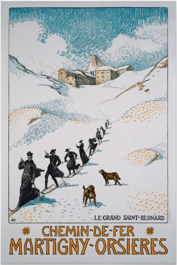
The 1920s, for example, are when skiing became a more popularized recreational activity. It was still looked at as a sport for the daredevil and epic risk taker, but its accessibility was increasing with the creation of resorts such as Davos, Chamonix, and St. Moritz. These resorts were once only summer havens, but transitioned to winter playgrounds to appeal to the small outdoor winter sports community. To give attention to these new winter opportunities, these European paradises had to advertise and show the larger population of city folk why it was worth it to make the trek up the mountains during the winters. Print advertising through posters was their solution.
The 1920s
The resorts commissioned the artists of the day to create eye catching and adventure-spirited visuals that could be plastered everywhere. The result was a mix of wild outdoorsmen and the muted colors and funky fonts of the art nouveau of Paris, such as the the example below.
The 1930s – 1950s
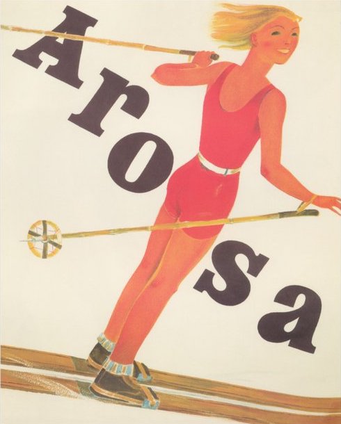
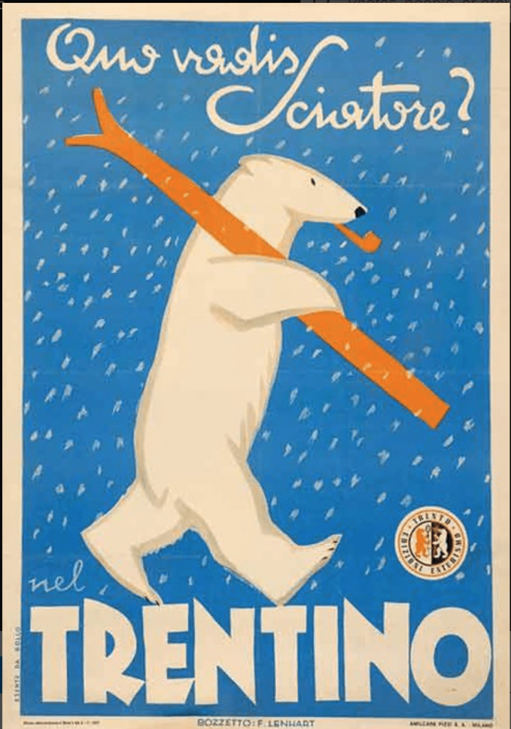
As the 1920’s transitioned into the 1930’s, the Great Depression came and hit the ski hills hard. When people couldn’t afford food and clothing, taking a day to go skiing was a hard sell. This reality called for a new poster strategy. Art nouveau was out, and art deco was in. The 1930’s created my all-time-favorite ski posters because the most classic vintage ski posters come out this era. This artistic greatness can possibly be contributed to the government work programs, which hired artists to create tourism posters. These artists knew how to capture that old-ski vibe perfectly. The posters of this era are more surrealist with a touch of exaggeration. They feature bold colors and dynamic fonts. Check out my favorites below.
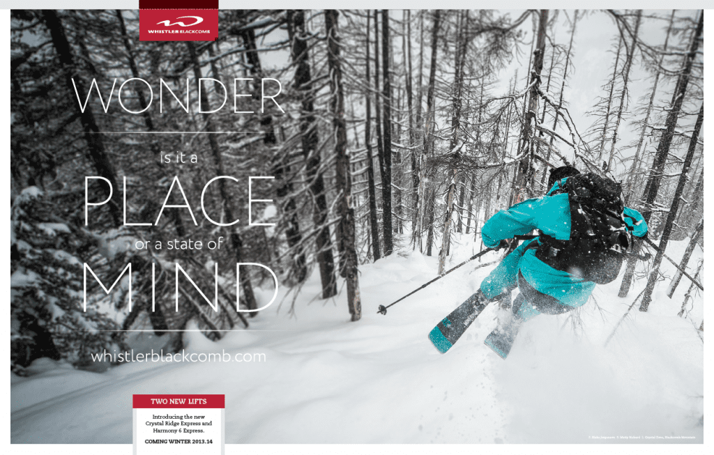
1960s and Beyond
The 1940’s and 50’s continued this art deco style, but then the 1960’s arrived and changed the game. Photographic posters became the new norm of the category and remain so even today.. These posters contain slogans and other catch phrases to draw our attention. Over time they have transitioned from print to digital, but the styling remains the same. I find that the use of modern photography evokes a different emotion because it is more relatable. Seeing a photo of a dirtbag skier bomb it down the back bowls makes me want to drop everything and just ski. Even looking at them now, I think I need to go take a quick ski break.

Whatever your opinion on advertising, you have to give credit to all the creative variations of ski posters over the decades. They masterfully mix the physical art of skiing with the fantastical literal art of skiing. These ski posters truly are art and their effectiveness has helped create modern ski culture.